Le Creuset
Launching a buzz-worthy new palette of cookware.
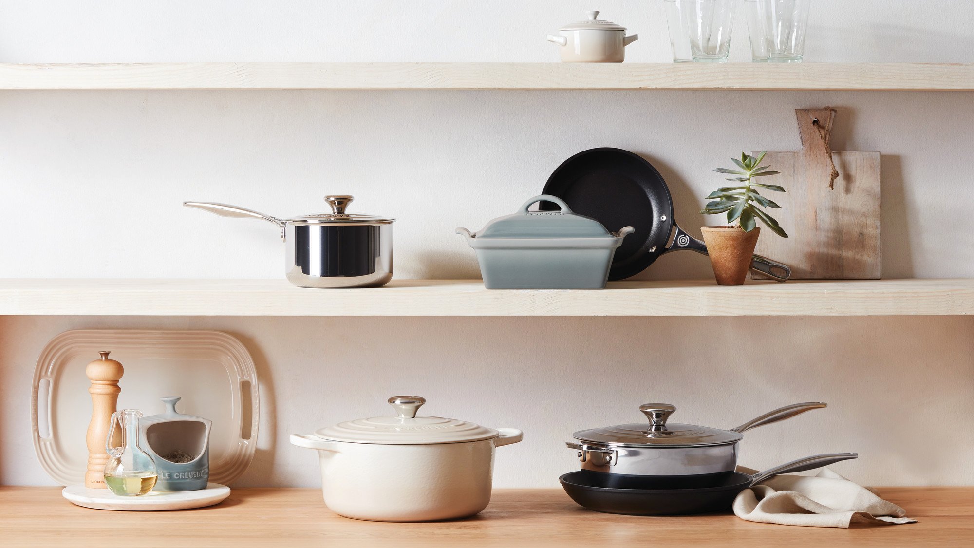
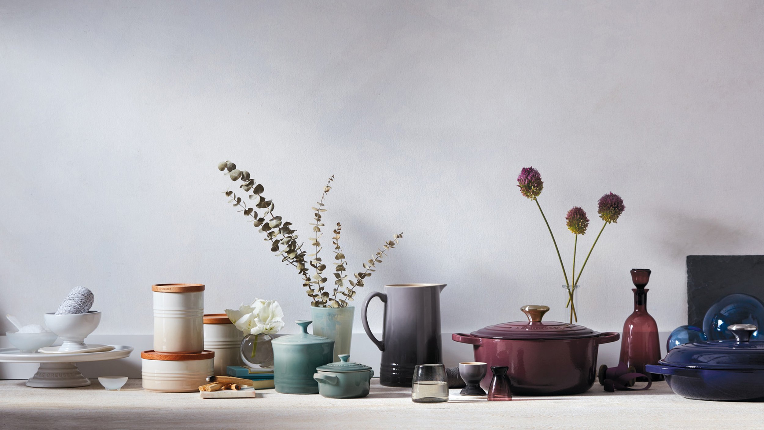
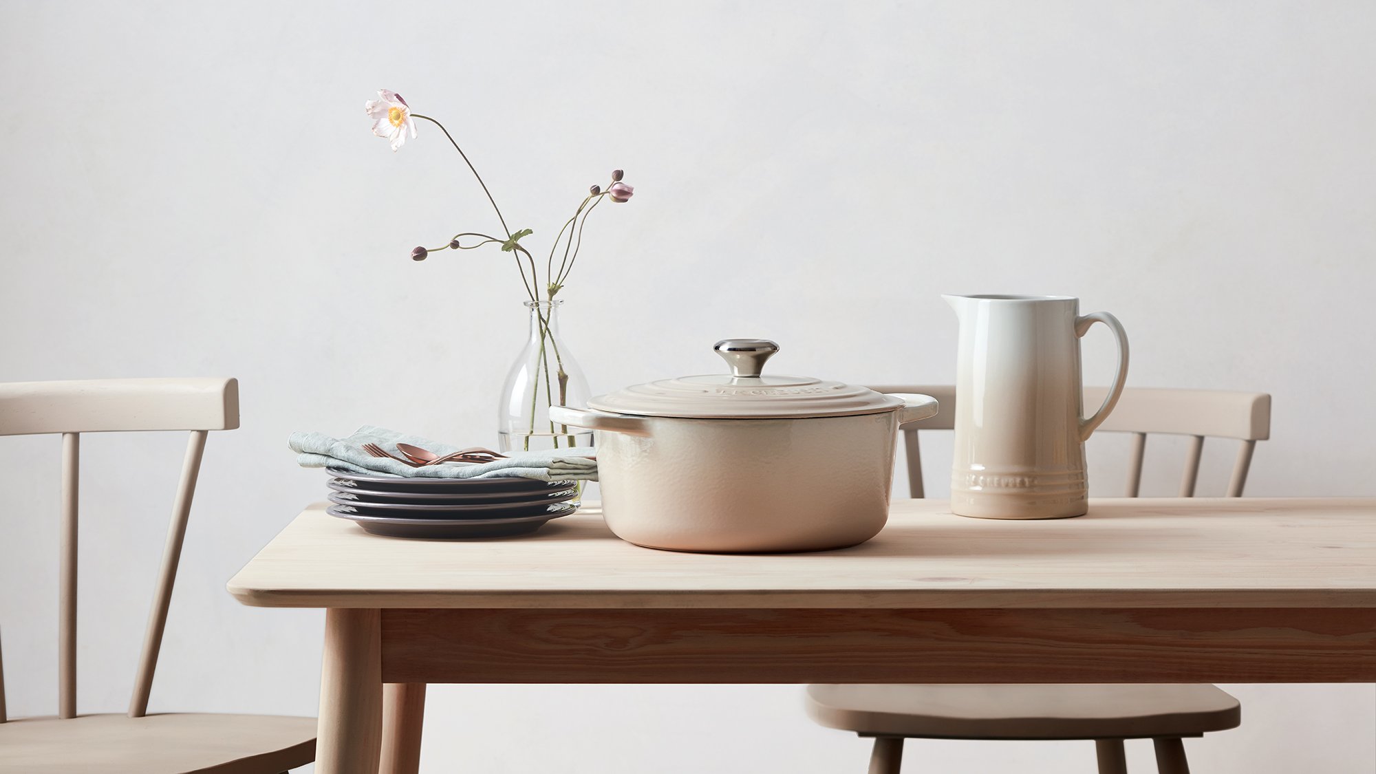
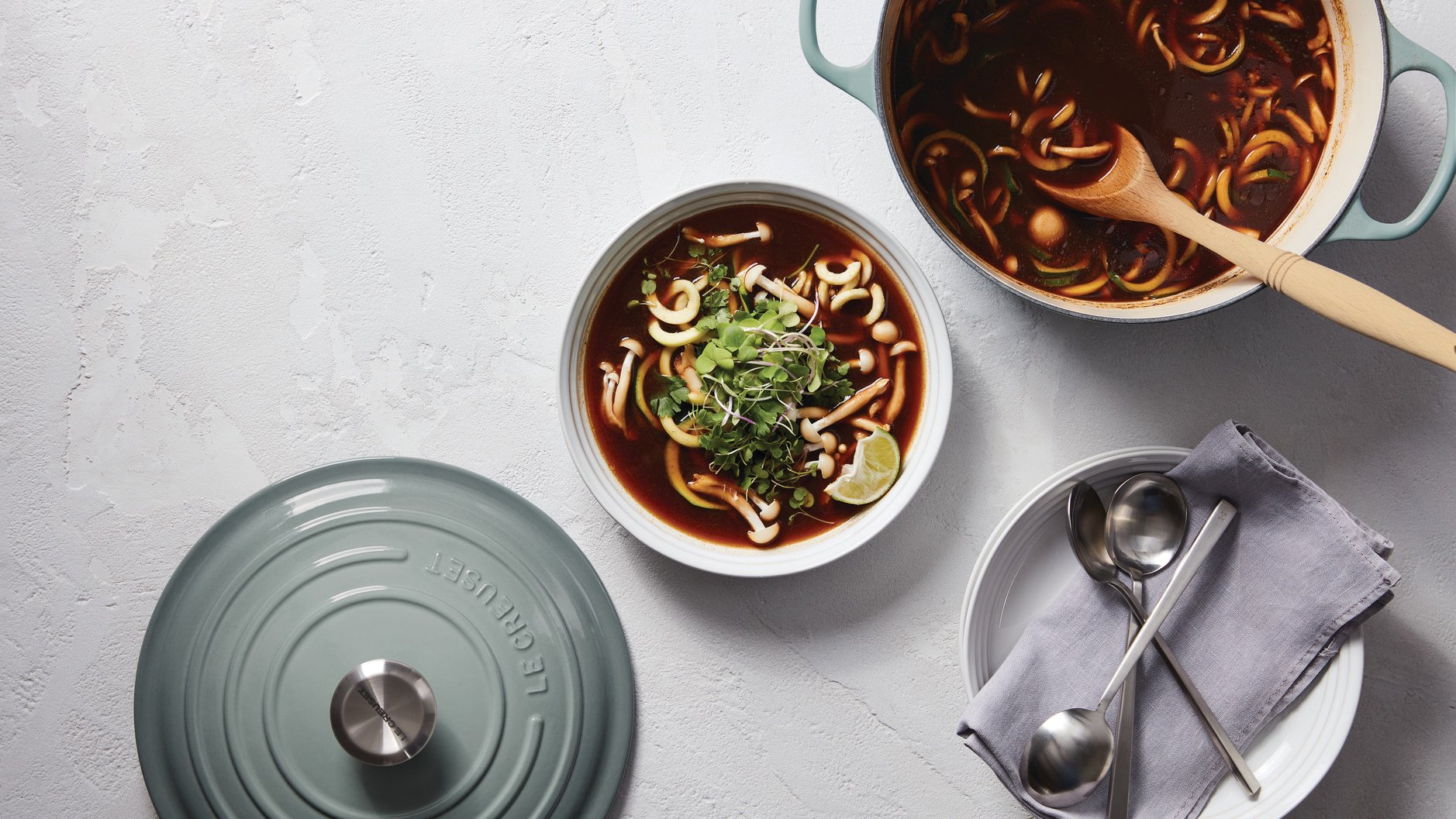
Le Creuset has been the leader in cast iron cookware since 1925, not only because of its unrivaled quality, but its range of beloved, design-driven color offerings. For the release of a new spring palette of neutral colors, I developed the platform and art direction that reflected the colors’ spirit of sophistication, minimalism, and thoughtful curation.

Introducing palettes.
In the past, Le Creuset has released single new colors to grow their core offering. This was the brand’s first step in a new direction focused on introducing branded, on-trend palettes of colorful cookware. The goals were to give consumers a broader offering to suit their personal kitchen style and help them see how their current cookware colors could expand to create new aesthetics.
Creating buzz for Sea Salt, Meringue, and Fig.
Our team positioned Le Creuset’s three new neutral colors in the market as “The New Calm”—a moment in time that represents a focus on clarified hues and comforting tones. The color campaign extended into social, digital communication, in-store support, video, and event installations, and was celebrated by dozens of publications and influential figures in food and fashion. The press mentions the palette received made it one of the most successful color launches for the Le Creuset brand.


